lOGO +
IDENTITY DESIGN
Logo Design / Print Design / Art Direction / Apparel Design / Brand Strategy / Brand Consulting
Whether polished or playful, I build brand identities that translate your skills and creativity into a visual presence you’re proud to share. Every design choice is intentional, supporting a brand that feels authentic, confident, and ready to grow.


The Objective
SP3O is a leadership program offering solutions to improve employee communication with in the workplace. Much of their performance hinges on dynamic presentations and continuous engagement. Starting from scratch without any original identity system, I worked with the client to develop a complete identity package that would also be integrated across all presentations and digital platforms.
With clean original iconology, enthusiastic colors, and professional typefaces, the brand evokes an established, solution driven design. Once approved I integrated its new visual identity into its presentation of 80+ powerpoint slides.


The Objective
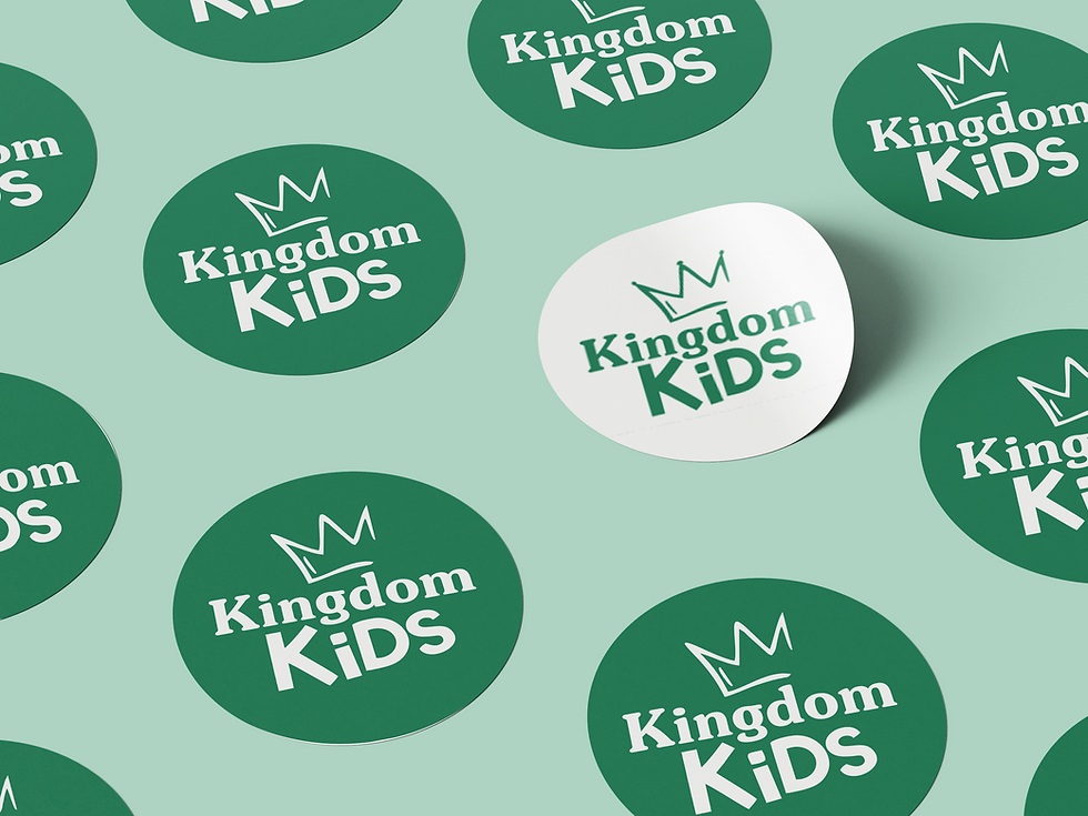
Kingdom Kids was a Brand proposal for a church children ministry program launch. Starting from scratch, the leadership was looking for a title that referenced Biblical themes while having the flexibility to encompass all age groups.


.png)
In effort to create a youthful design while incorporating a timeless look, I paired a San Serif and Serif type. After selecting the font I transformed and reconfigured the letters to create a motion and more visual interesting silhouette.
Since the church brand palette utilized teal, I selected a slightly different hue to be most prominent. This would allow continual recognition within the entire church identity, while still leaving room for some program distinction.
The iconography provides a youthful vision for young and mature students alike. Along with the fun alliteration, the name presents an imaginative and biblically based context for people to connect with.
tHE dIRECTION


-02.png)

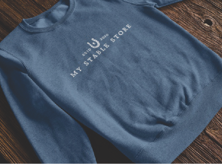
The Objective
My Stable Stores is a division of a larger custom apparel store, meeting the specific needs of the equestrian community through offering Custom Online Stores for individual businesses.
Looking to stand out as an industry leader, the client sought to create a visual identity that both barns and stables could relate to. Together we created a versatile brand image creating access and promoting cohesion.